
You know what they say... If you don't have a logo and haven't raised money, then a startup can't even exist. 🤣
In all seriousness, I was very intentional about developing the branding of Cogsy and did so very early (and before many other things). Loosely this was the stepped approach I have followed to get the various parts of Cogsy together:
- The idea & initial research. This was all about understanding the technical bits required, what the competitive landscape looks like and ultimately what a product (for V1 and beyond could look like).
- The brand. Then, before anything else, I worked on the brand. I wanted to be able to use the brand to put together a simple website (primarily to hire an initial team) and pitch deck to speak to investors. I also ideally wanted something from which I can build the first version of the product.
- Getting funded. I knew I didn't want to self-fund Cogsy (even though I am reinvesting my own capital too), so since I had the idea I had been loosely speaking to investors. In the end, the deal that Dan & I did was pretty unconventional, but noting this step here for the plan.
- Build V1. I'm very specific about the type of team I want to build (for starters, I want to optimise for diversity from Day 1) and I expect it to take slightly longer than usual to find the best individuals. So I'm building V1 with a contracted team for the sake of speed.
- Initial Team. Goal would be to get the initial product team hired and in place with sufficient overlap with the contracted team to do handover and an easy transition.
- Launch & go. 🚀🚀🚀
I'm naturally leaving out a few steps (like building an initial website, developing a lead magnet, all of the admin that comes with setting up a new company etc) that have been part of the process too. But what I tried to give you context about is where I prioritised the branding and why I did it.
Let's dig into the process...
The Brain Dump
Whilst I was doing the technical and competitive research for Cogsy, I kept updating a separate document that broadly took all of that learning and translated it to things that would relate to the brand, messaging and positioning of Cogsy.
Here is the final version of that document (which I ultimately passed onto the design):
I had identified a few key components to make sure that when I pass this "idea of Cogsy" onto someone else, that I would give them sufficient colour to great a masterpiece. The components that I think are important:
- Some backstory that is more qualitative and not obvious on first sight;
- Any values that you want to aspire to (or a company mission / vision if you already have);
- Details about the ideal customer (because the branding needs to resonate with them);
- Early thoughts about value proposition and positioning for the product (including some reference to the competitive landscape);
- Visual details and preferences that can help guide a designer (especially if there are big turn-offs); and
- An overview of the early product and marketing strategy (because the initial brand definitely needs to support that).
The Experts
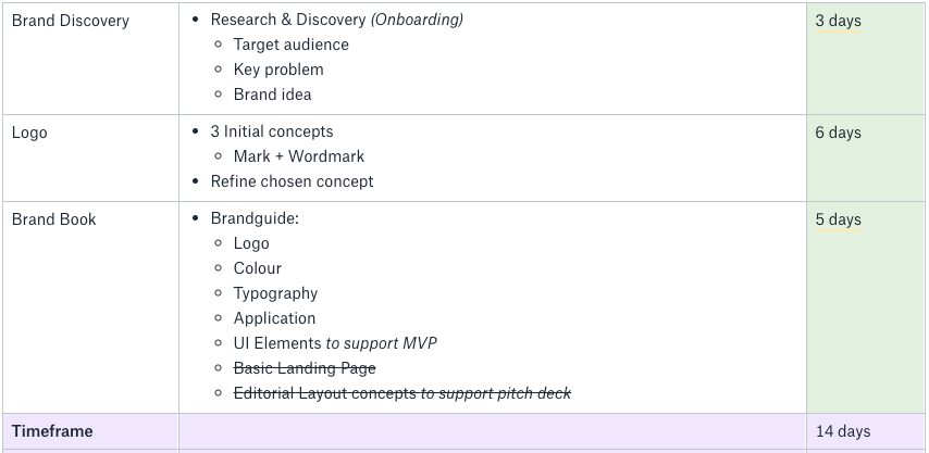
The next step was to engage Rosie Manning (who brought in Liam Bush & Damian Kidd to assist) to take my initial brain dump and turn it into a brand / style guide. Here's the scope that we agreed for the project:
The first step was to have a discovery call to add more colour to the initial document that I had put together. Rosie & Liam ran the call and asked a bunch of qualitative questions about the brand and product. The questions and their shorthand notes are here.
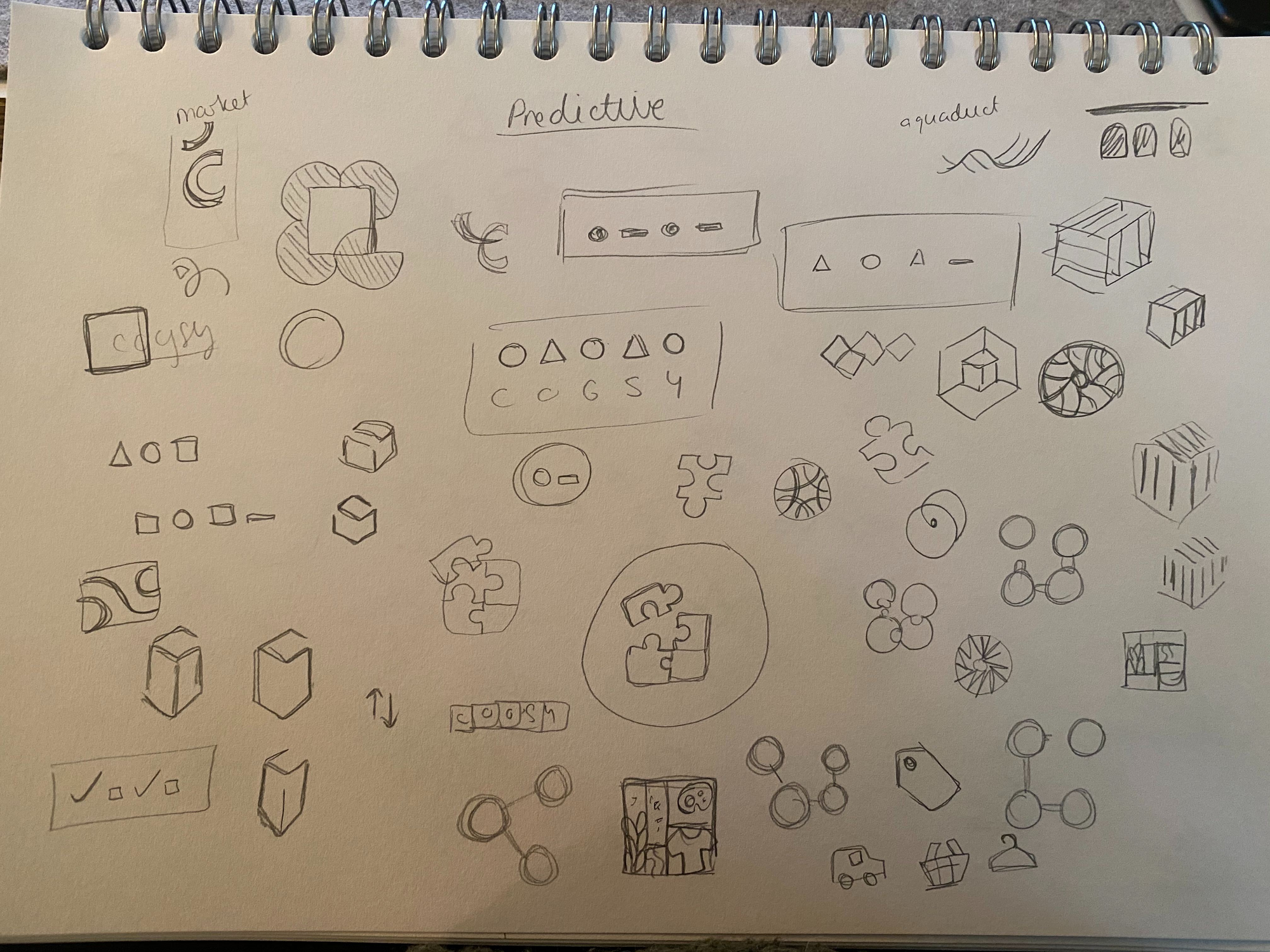
From here, Rosie and Damian went away to explore logotypes and marks based on all of the qualitative things that we'd identified already. Having visibility into their sketches and visual exploration was supremely helpful, as it turned words into something more concrete and sparked a whole new conversation about what the logo could look like.
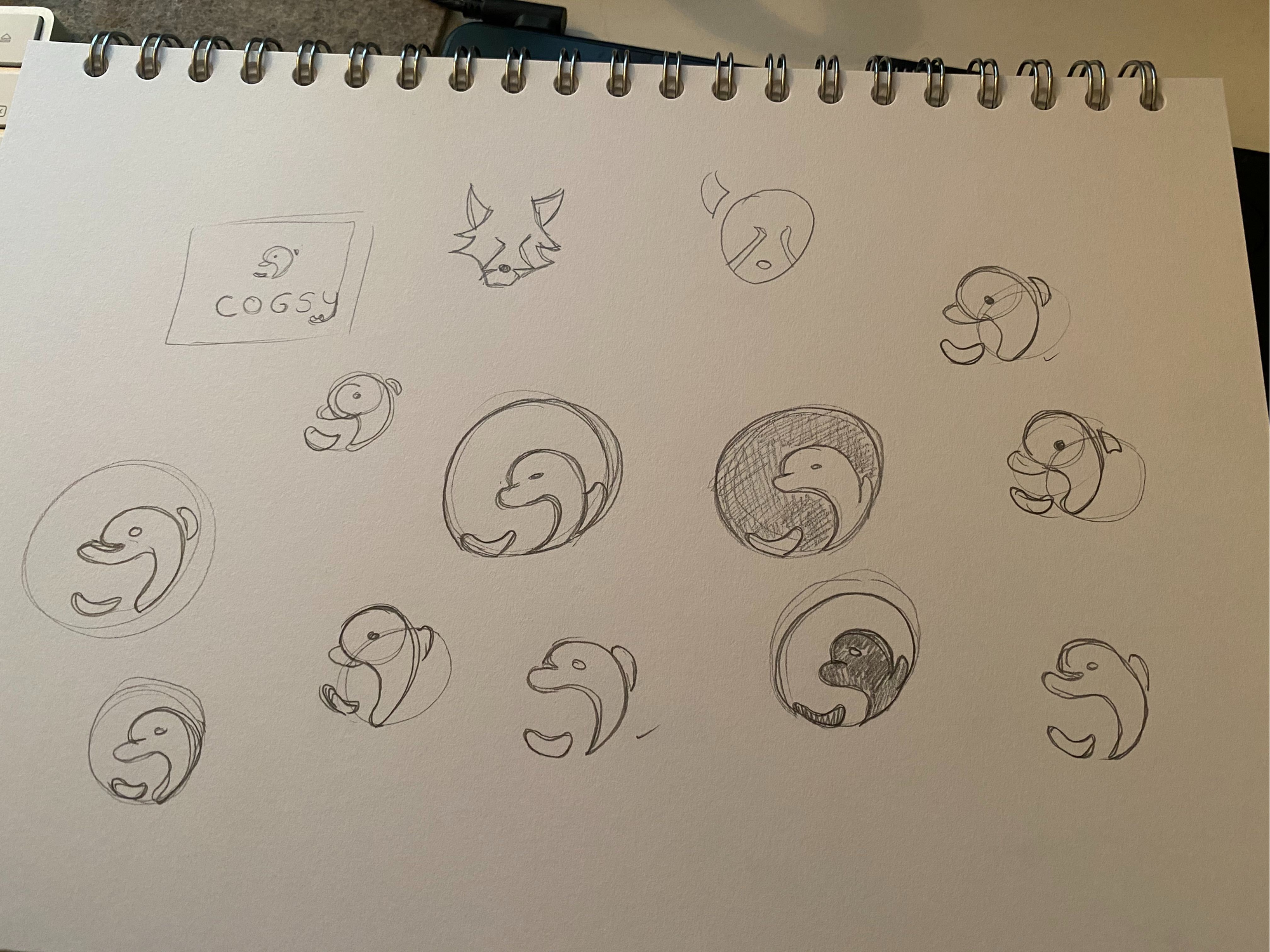
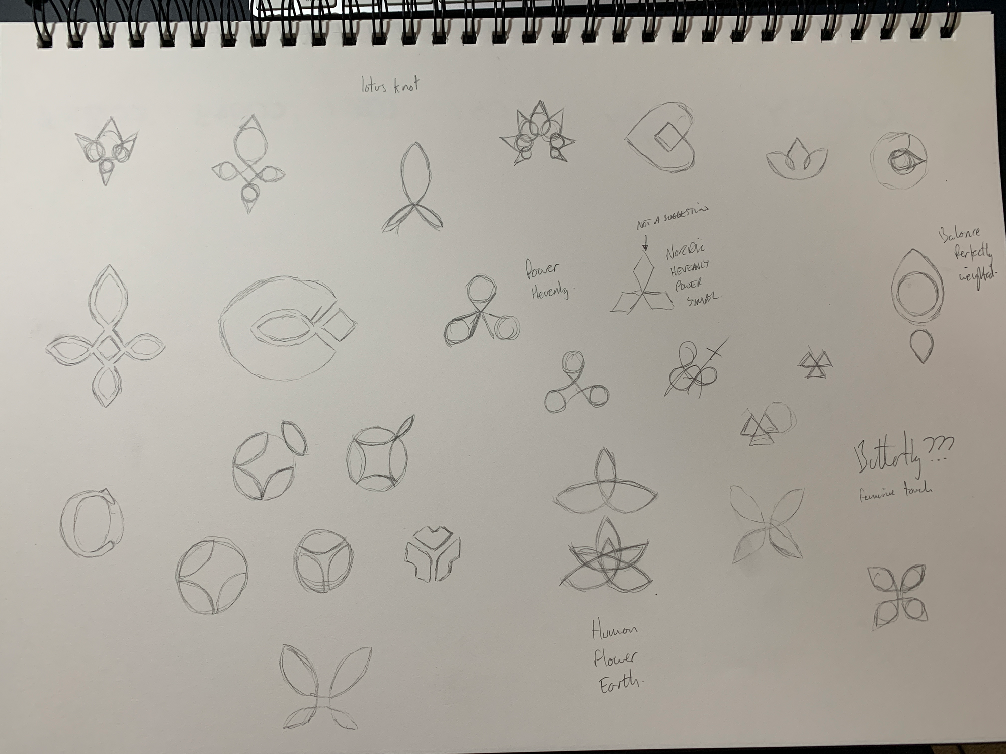
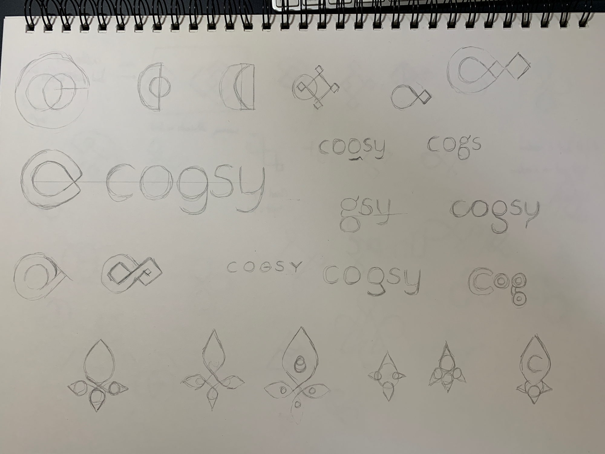
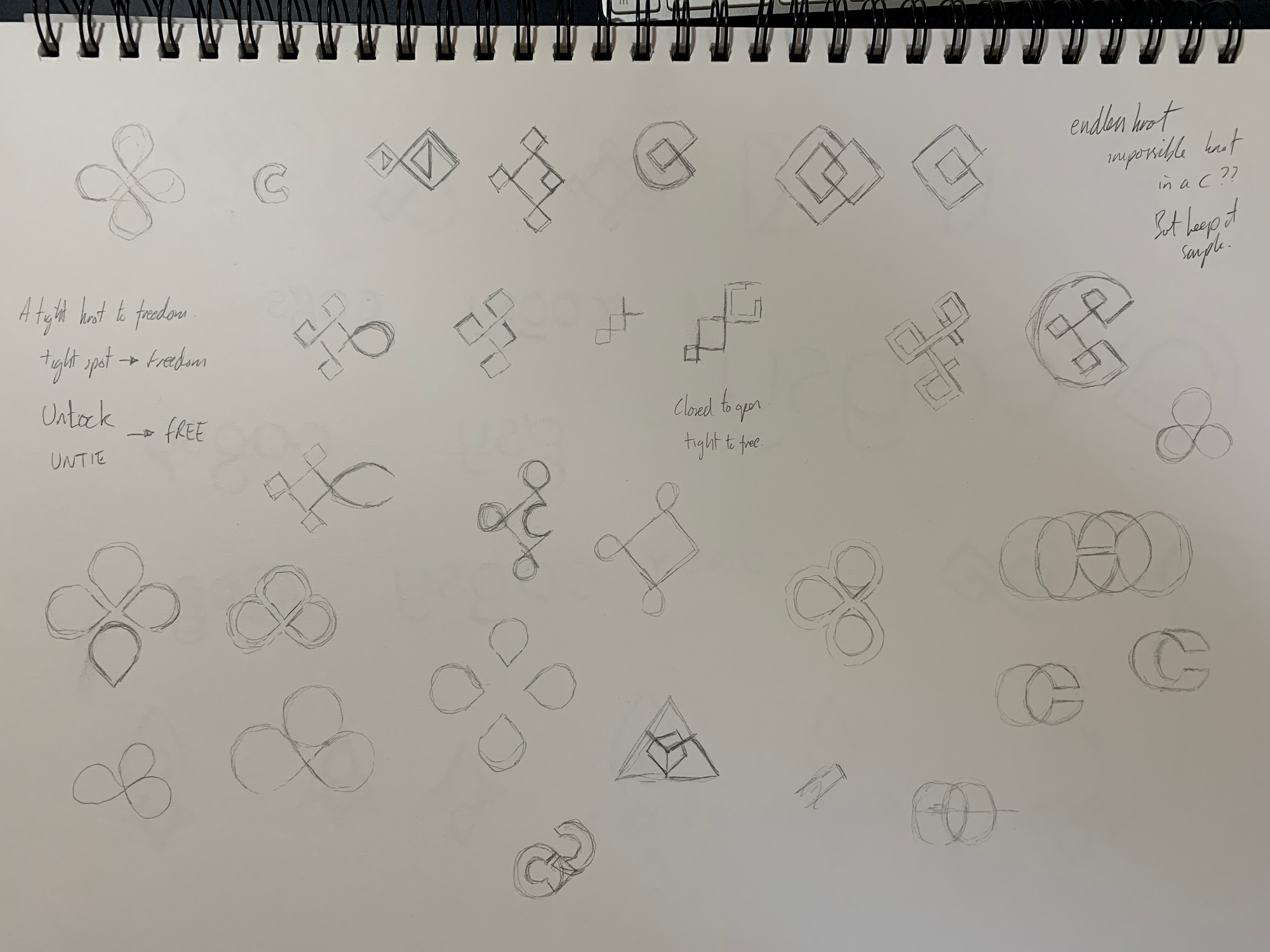
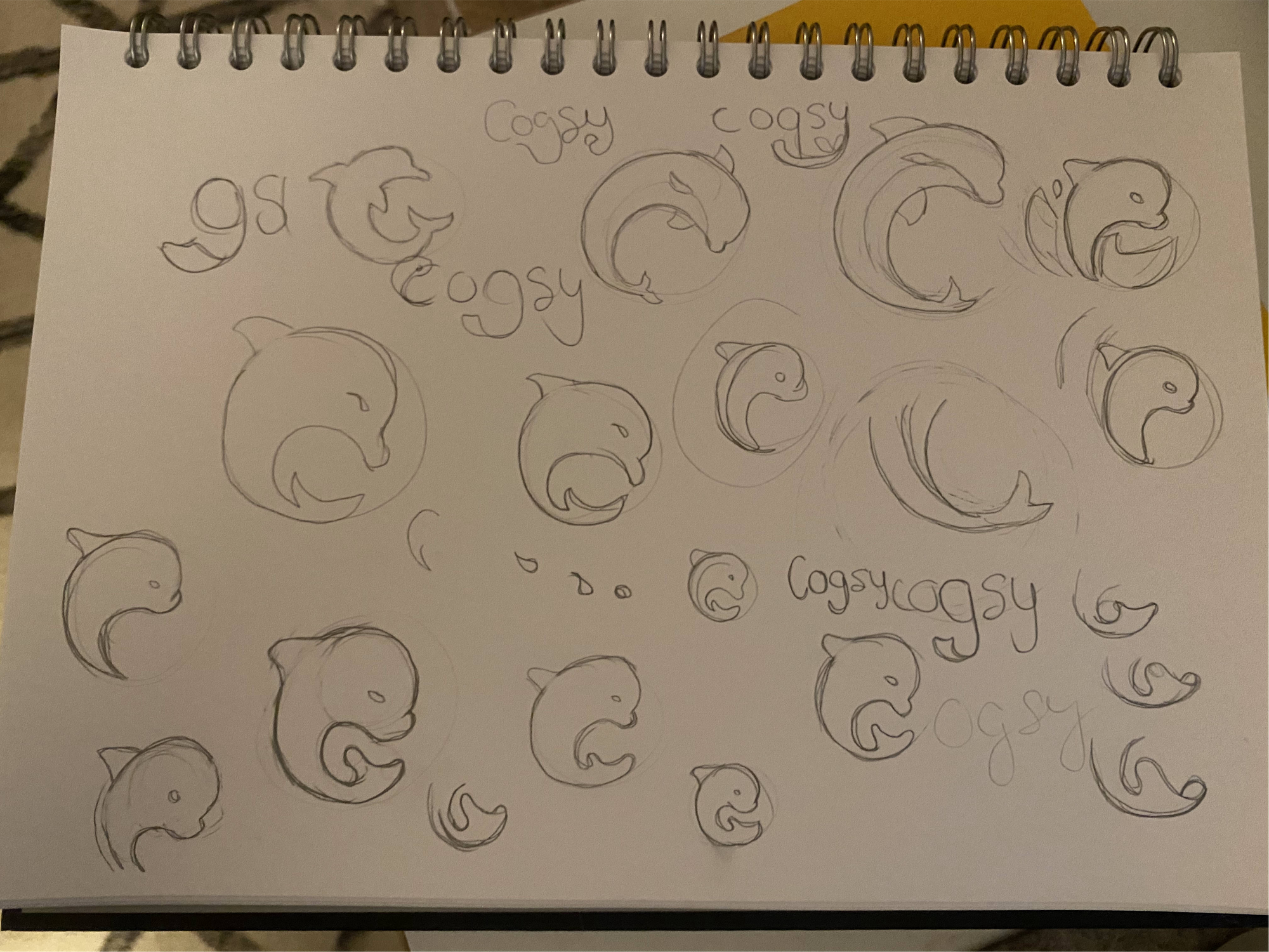
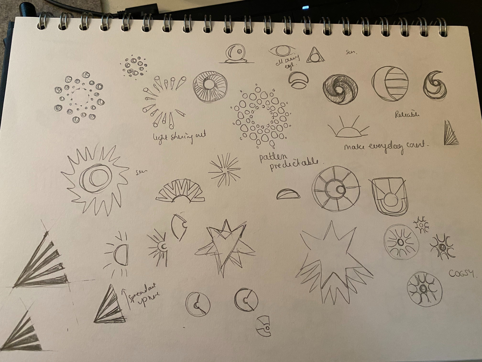
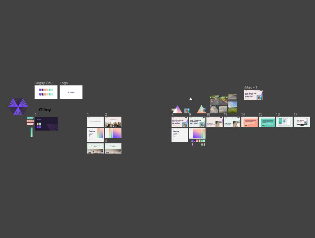
Based on the sketches, we picked three prototypes / paths to explore in much higher fidelity. And again, I didn't just get a single, polished prototype... Instead the Figma file contains so many of the other paths that the team also explored:
Here's the various higher fidelity prototypes that we considered next (38 in total, but some are just a small variation of another):
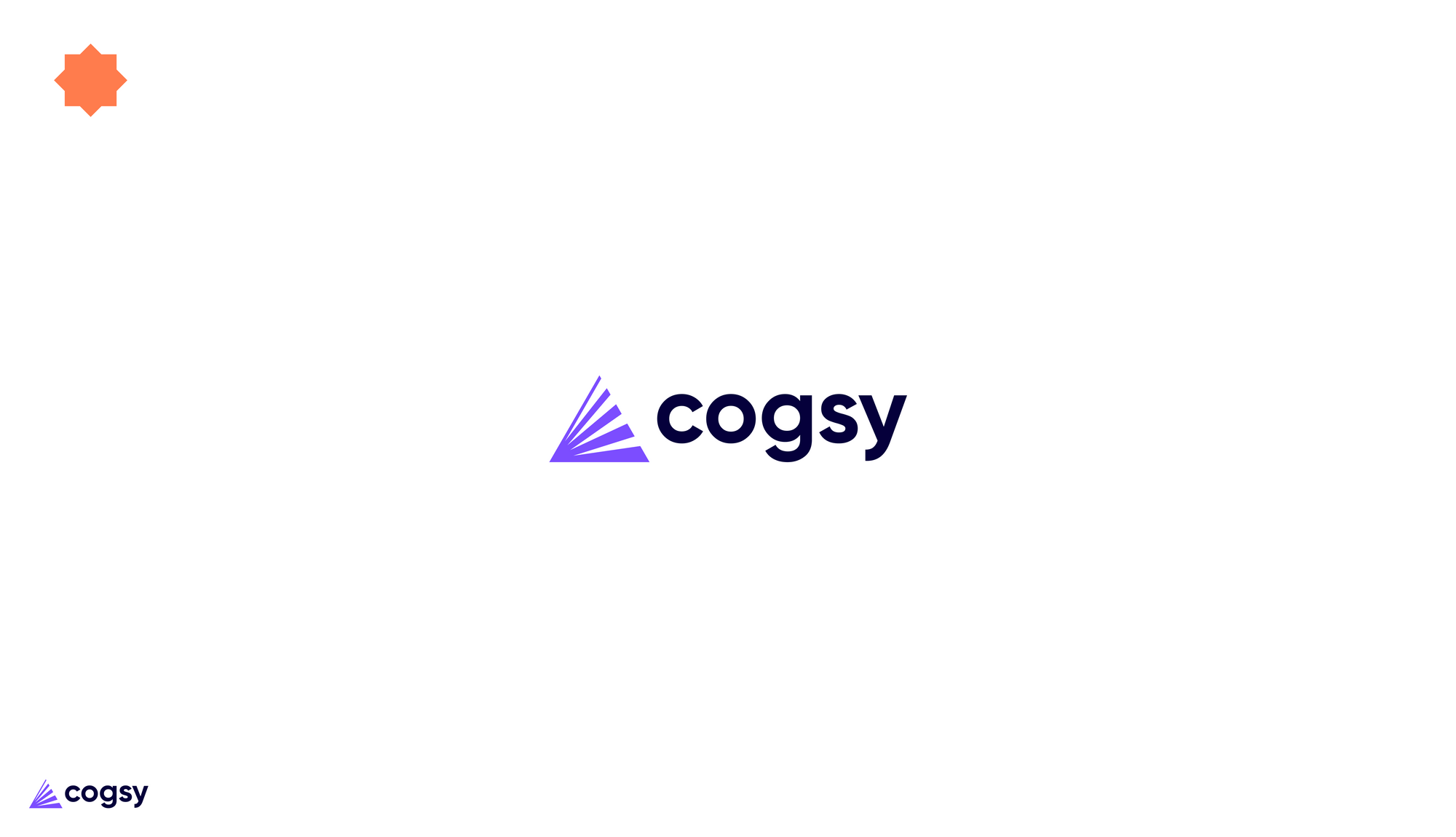
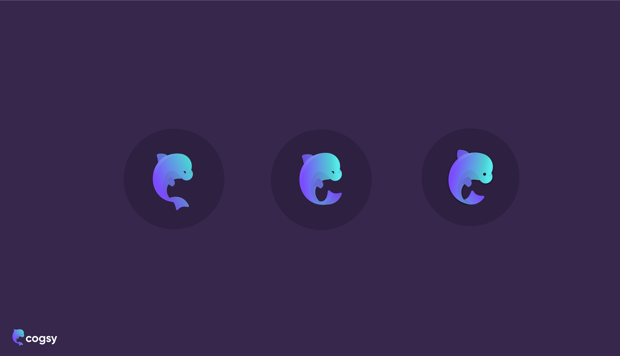

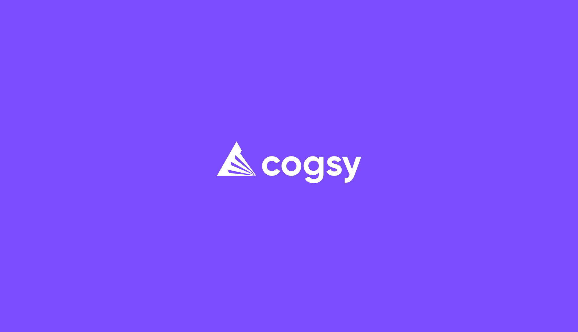
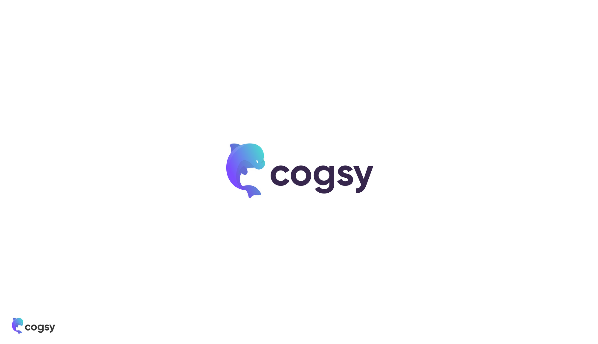
You'll see that right at the top (left) there is a prototype that we marked with an orange star, because that's the one we decided to go with. That mark ultimately underwent a little refinement (you know, making sure it adheres to The Golden Ratio and all the other technical, expert things designers do 👩🎨) before wrapping up.
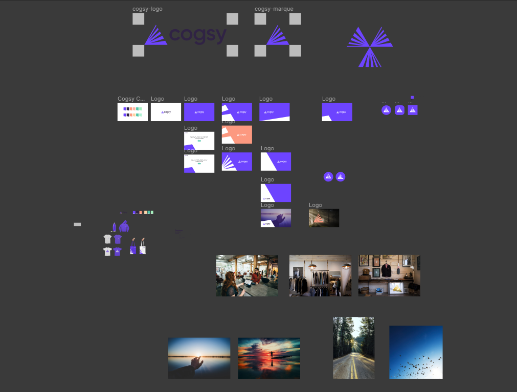
The next step was to take a logo mark and extend it into a visual language that could be used throughout. The simplest step (and the last step that I was involved in) was to pick a colour palette:
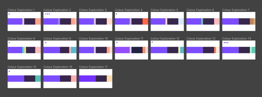
I think what was important with the colour palette was picking both something that reinforced all of the values and themes we had identified for the brand, but to also anticipate how we'll be using the colours in future.
At this stage, there's no concrete idea of what a MVP of the product looks like, so no idea what the UI / UX will be. Neither are we sure exactly about customer-facing messaging or what a marketing website or any collateral looks like. So I relied heavily on Rosie her to get us a robust colour palette that would be pretty future proof (which in my mind implies that it should serve us for 2 / 3 years before we even have to consider evolving it if even needed).
Separate to the colour palette, Rosie and Damian again did what designers do best and explored a greater visual language. This is the part that I actually didn't see whilst they were working on it, but it is now fun to see their work-in-progress bits in hindsight (because it shows the thought process which may be helpful to me or whoever needs to implement the brand in future:
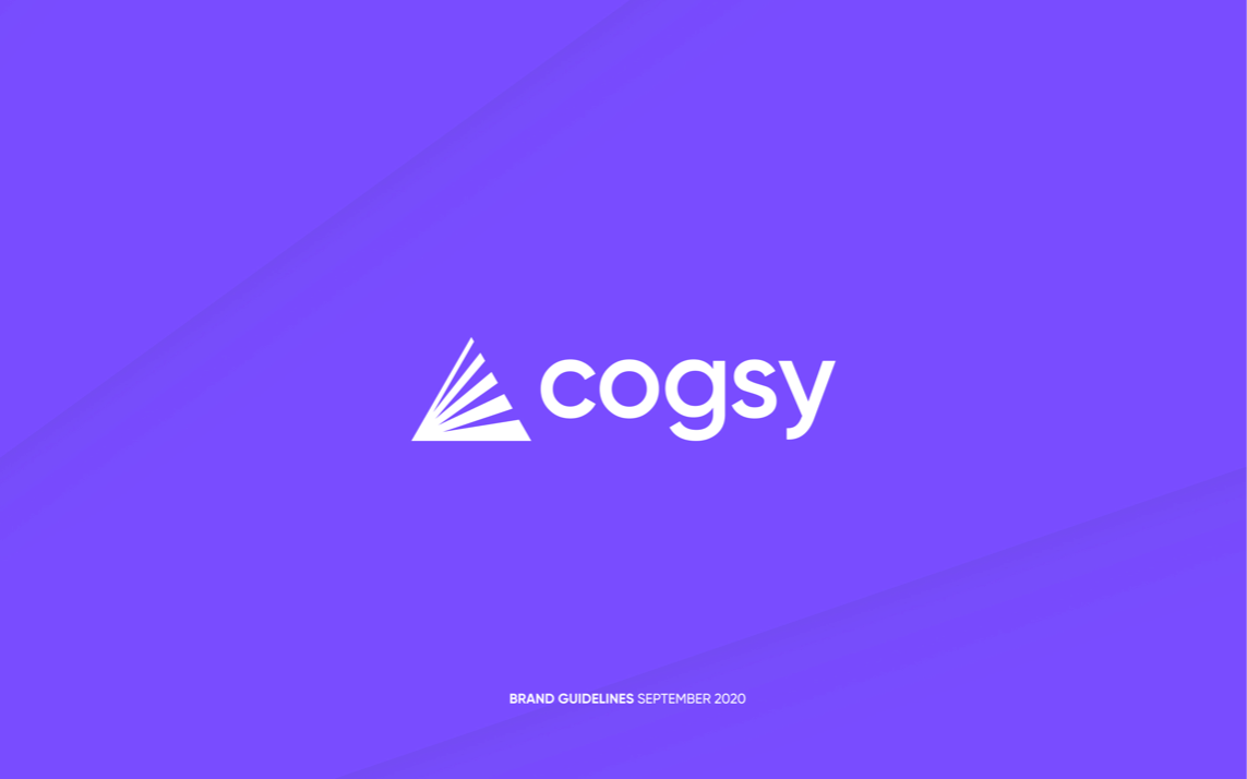
And finally this is the polished brand guide that they put together:
Based on brand guide, I have been able to use my rudimentary design skills to put a website together, design some ad assets, create the lead magnet and we'll crucially be using the brand guide to inform the UI styling of the first version of the product.
So whilst the brand guide itself doesn't hold much value in an isolated or independent manner, it's value comes in the form of the speed and cost at which I'm able to make progress on other things. The website for example is not a perfectly designed or executed version, but it was also something that only cost my time (which too was greatly reduced because I could just replicate design standards from the guide), thus preserving financial resources for other things.